This thread isn't getting too much new stuff, so here's one. Taken a block from my house in Hawthorne NJ. Nikon D600, 28mm 2.8D, 13 seconds at F5.6, ASA 200.
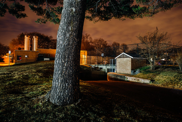

I'm guessing the dual coloring is high pressure sodium street lights for the sky and background, and something whiter for the tree and foreground?
Anyway, a quick scan around the image makes me wonder if just a little detail could be brought out in dark lower right area, without making it too light. Not so much a critique as an itch to experiment.
What lens and settings did you use on this?
tygr: I was asking about the lens, because I thought the bokeh needed to be softer. Not sure you can with that lens at 5.6. I do like these kind of shots. Be curious of the color version.