TheRed1
Console Conservationist
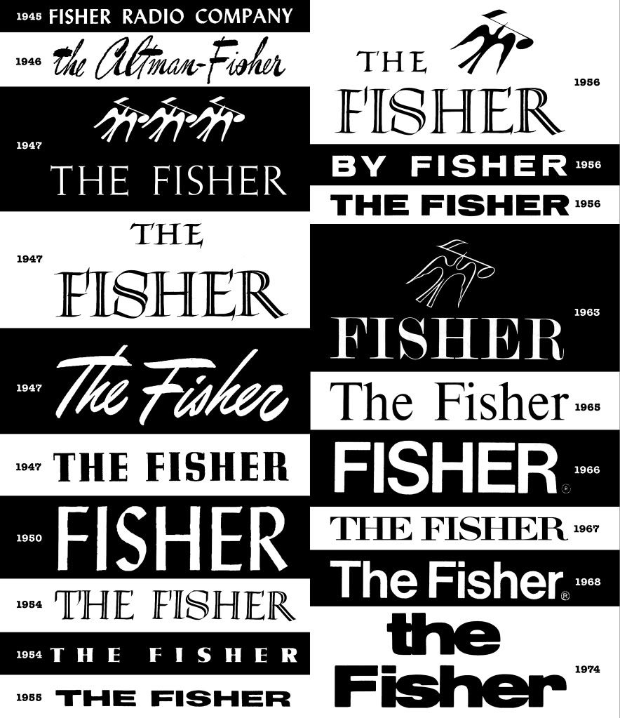
Avery Fisher loved typography. “Looking at a beautiful typographical design,” he told an interviewer in 1976, is like listening to music.” His first job in the early 1930s was at an advertising agency that catered to book publishers. In 1932 he went to work for one of those companies, G. P. Putnam’s Sons. A year later he was with Dodd, Mead and Company as a graphic designer. He continued to work for them throughout the 1930s while, in his spare time, he began tinkering with radios and amplifiers. In fact, he didn't quit his day job - so to speak - and continued with Dodd the entire time he was building up his first company, Philharmonic Radio Co. He finally resigned in 1943 but would occasionally undertake high-profile book designing projects that interested him, donating the proceeds to charity.
A February 1956 profile of Avery Fisher in the NY Times mentioned that he, “...writes every line of the instruction material and other printed matter, and designs the type layouts, just as he did in the old days when his product was a book.” So, as part of Fisher’s 75th Anniversary celebrations, I thought it might be interesting to look back at the evolution of Mr. Fisher’s typographical design aesthetics.
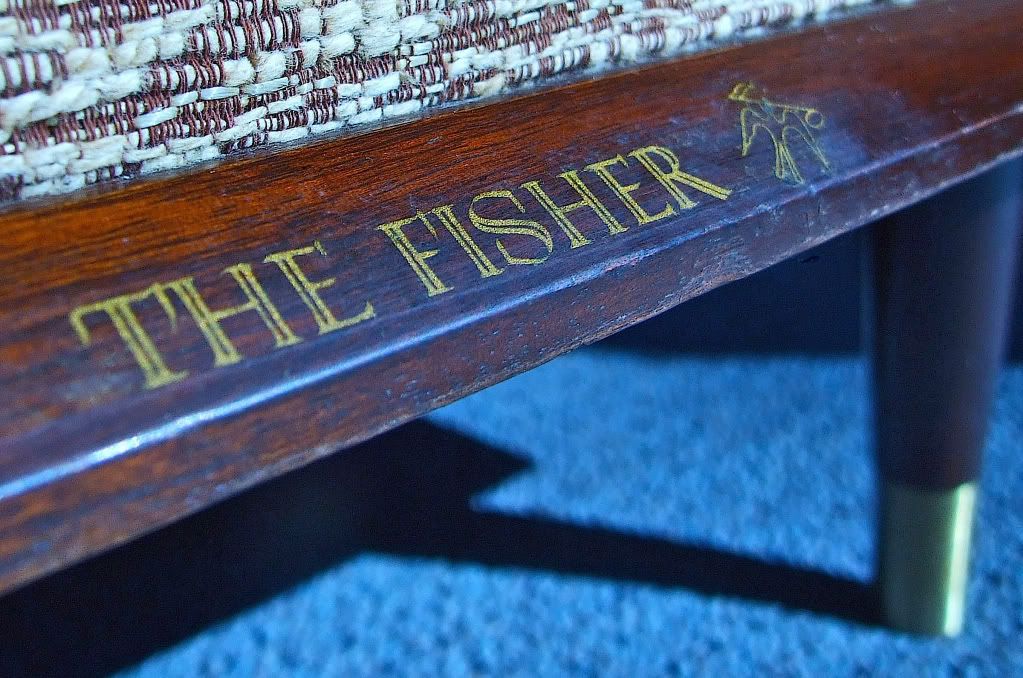
So what font is your Fisher? I would love to see more especially if I don't have an example posted below. These are a few of mine and some other notable examples that I've collected. (I used to think you could date Fishers by their font or whether or not they were 'The Fisher' 'Fisher' 'By Fisher' etc. - but there are so many exceptions to the general trends that it really doesn't work very well.)
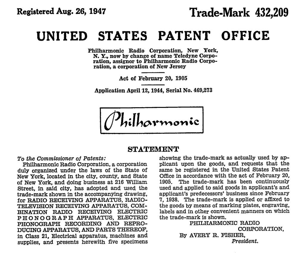
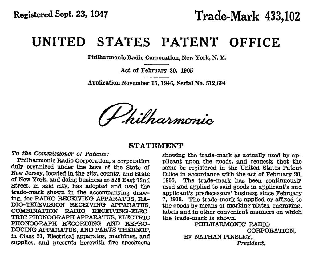
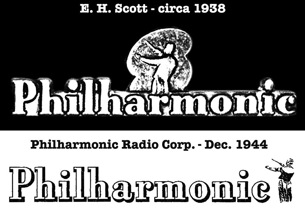
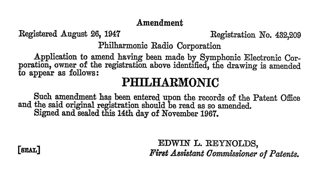
1937-1942 Philharmonic Radio Company
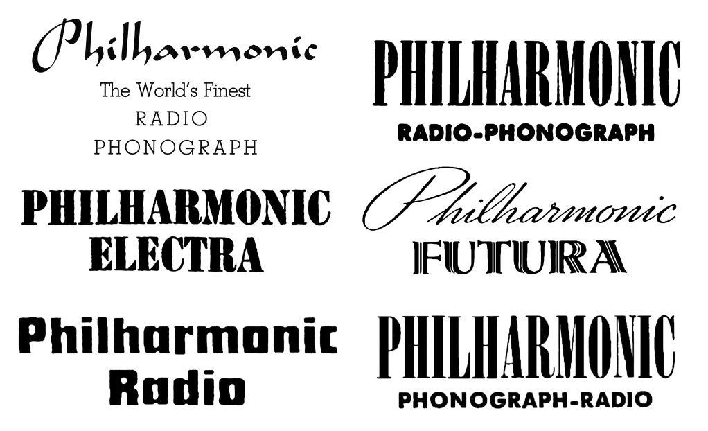
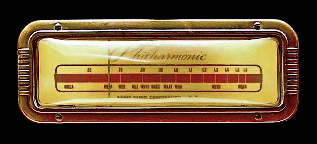
1937 Philharmonic Futura (Courtesy the Smithsonian Museum of American History)
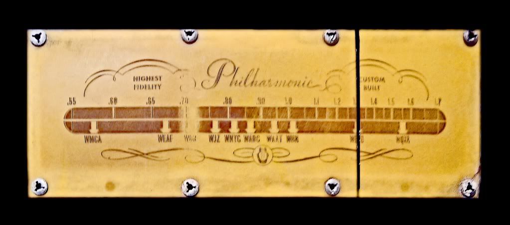
1939-40? Philharmonic Linear Standard (Courtesy Al Germond)
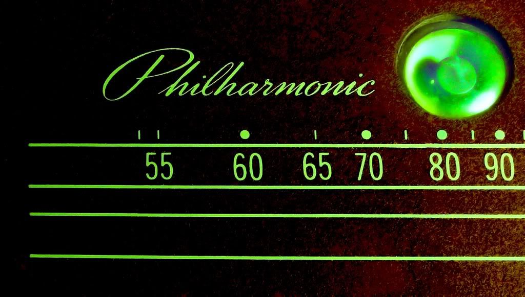
1941 Philharmonic Futura K-1
1945 - 1969 Fisher Radio Corporation
1946-47? Fisher S-1/S-2/K-2?
1947 Fisher 24B "Anniversary Model"
1948 Fisher SA-1
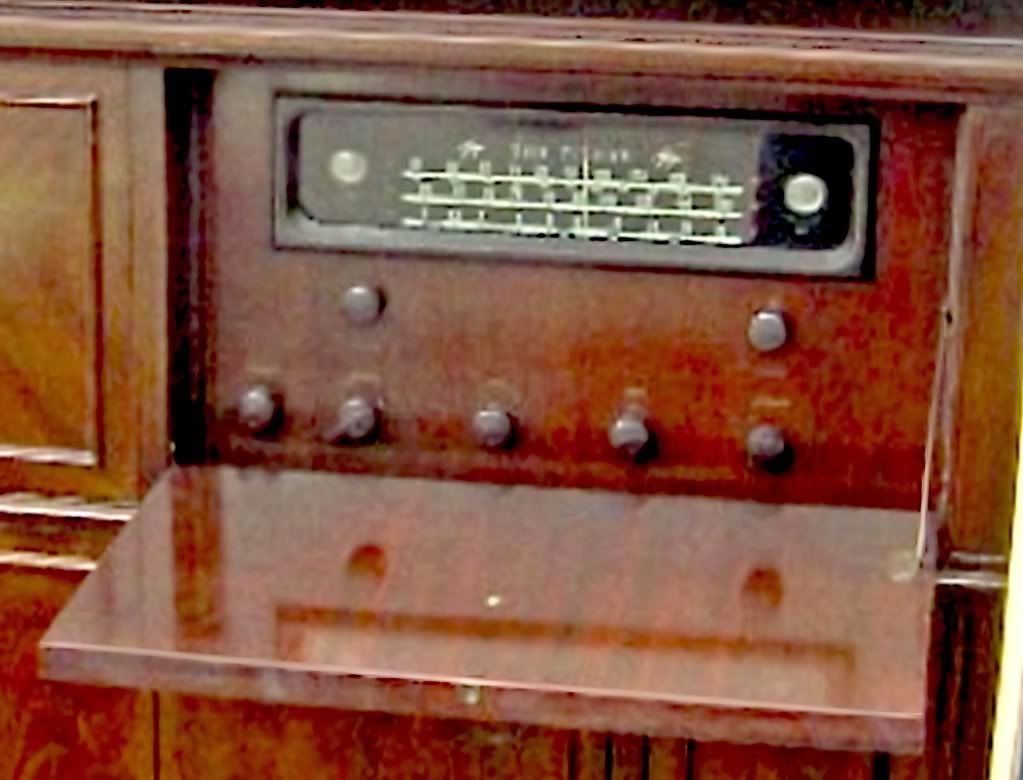
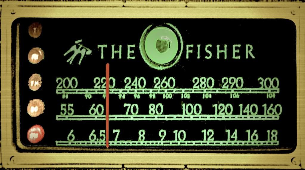
1950-51? Fisher Coronet R-3
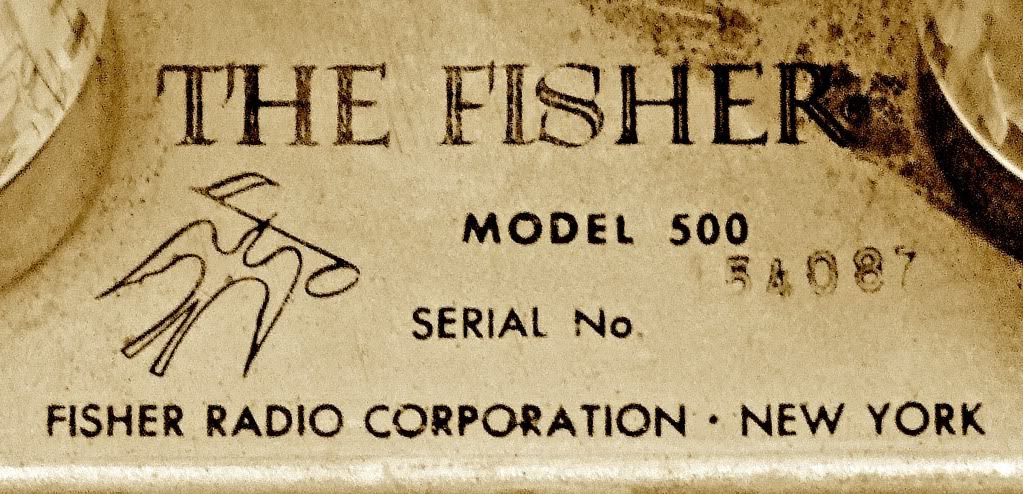
1958 Fisher 500
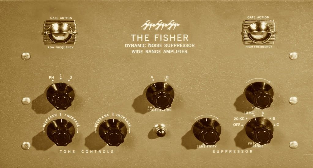
1959 Fisher Contemporary II
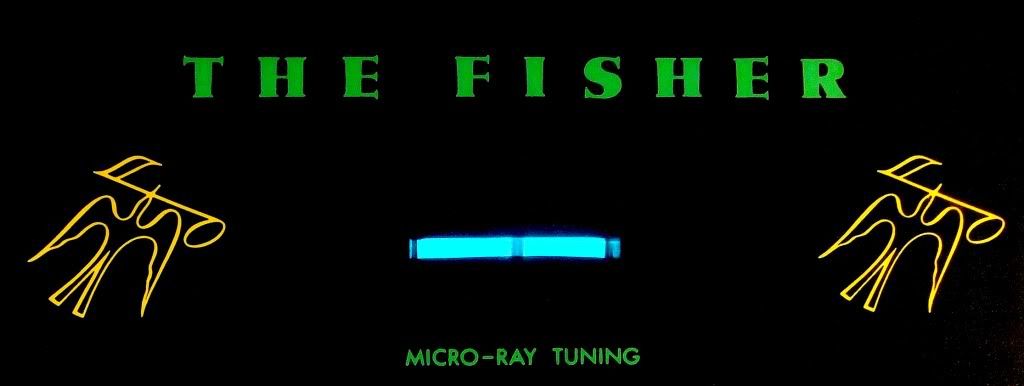
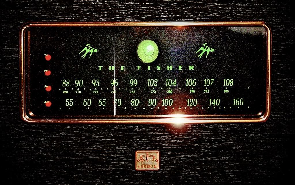
1959 Fisher Stereo Companion 560
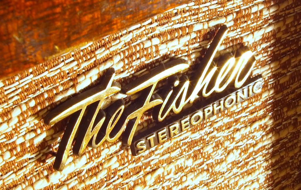
1960 Custom Electra III

A February 1956 profile of Avery Fisher in the NY Times mentioned that he, “...writes every line of the instruction material and other printed matter, and designs the type layouts, just as he did in the old days when his product was a book.” So, as part of Fisher’s 75th Anniversary celebrations, I thought it might be interesting to look back at the evolution of Mr. Fisher’s typographical design aesthetics.
So what font is your Fisher? I would love to see more especially if I don't have an example posted below. These are a few of mine and some other notable examples that I've collected. (I used to think you could date Fishers by their font or whether or not they were 'The Fisher' 'Fisher' 'By Fisher' etc. - but there are so many exceptions to the general trends that it really doesn't work very well.)
1937-1942 Philharmonic Radio Company
1937 Philharmonic Futura (Courtesy the Smithsonian Museum of American History)
1939-40? Philharmonic Linear Standard (Courtesy Al Germond)
1941 Philharmonic Futura K-1
1945 - 1969 Fisher Radio Corporation
1946-47? Fisher S-1/S-2/K-2?
1947 Fisher 24B "Anniversary Model"
1948 Fisher SA-1
1950-51? Fisher Coronet R-3
1958 Fisher 500
1959 Fisher Contemporary II
1959 Fisher Stereo Companion 560
1960 Custom Electra III