• The move to the new server is done. There are some software and database maintenance updates in process. This has us passing the hat around to help out. We appreciate any donations. Seriously, even a dollar helps. The payment page may be found here - https://www.audiokarma.org/support.html

Sansui 2000 faceplate restore

jmjrcv

Sansui and Fly Fishing, that's it....and Bourbon
Subscriber
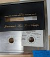
I'm working on a Sansui 2000 receiver that has the Volume and Selector labels worn off and I'm in search of some help in restoring them. I want to try some water-slide decals to see how well that might work but I need an image of the labels to work from. Can anyone help out here?

Here's what I'm trying to fix:

2000_fp.jpg

I think I can register off the holes when placing the decals and scaling my final image. I really don't know of a good method to restore the scraped off black paint around the tuning knob so I'd love to get some advice there too.
 
Register to hide this ad
I'll contribute this tidbit to the effort: I believe the typeface used for the legends on this would be "News Gothic Extended" (link to useful reference site below) and that would at least get you an accurate match for the text on the panel. You could then recreate the markings on a computer to make decals, or even have the label laser engraved (and then fill the engraving with black enamel)

 
I'll contribute this tidbit to the effort: I believe the typeface used for the legends on this would be "News Gothic Extended" (link to useful reference site below) and that would at least get you an accurate match for the text on the panel. You could then recreate the markings on a computer to make decals, or even have the label laser engraved (and then fill the engraving with black enamel)

Thanks for this! I have been scouring the bay for photos of intact markings and was just contemplating asking for some AI help in identifying the font.

The thought about laser engraving is intriguing. I would much prefer a solution like that if for no other reason than to avoid seeing the obvious edge of a decal. I will experiment with the decals though, just to see how they look.
 
I will say that the stroke weight (line thickness) of the factory screen printed legends Sansui used is much lighter than the matching digital font I linked. Unfortunately, I've found no solution for that, so just be aware the new legends will probably look "heavier" (or bold-face) by comparison.

If you can find a local trophy shop that will work with you, and can make up the camera ready art yourself on a computer, they could take that and use it to engrave new legends in the panel. The digital art file would have to be exact 1:1 sized (you can print proofs on transparency film to check alignment to openings in the metal substrate) and requires a bit of skill to do, as well as a decent image editing program.

I've done similar projects with the assistance of a local engraving company. Once they've done their part, I use Testors model enamel slightly thinned, and drawn into a syringe. Then I deposit small amounts of the enamel directly into the engraved marks, let it set, and use thinner and a soft cloth to remove any that "went outside the lines". Have had good results with this approach.
 
Last edited:
I saw that "News Gothic Extended" doesn't have a digital version but "Trade Gothic Extended" does have a downloadable version and it was described as virtually identical with the exception of the Q. After a few fits and starts I came up with this mockup:

2000_selector.jpg

I used the blue lines for rough registration and the dark circle is the diameter of the knob. I think the line thickness is actually pretty close to the original, and in fact when I first printed with the font, I was worried it was too thin to match :dunno:

Next step is a decal trial then I'll see what happens. The thought of using a trophy shop to do engraving is another useful suggestion, thanks for that too!

Edit: On looking back at my work, I should note that I actually loaded a slightly different version of the Trade Gothic font not knowing how to interpret the naming conventions. This may have a bearing on the matching of the line thickness. This is what I grabbed Trade Gothic LT Std Extended
 
Last edited:
Very nicely done. I must've mixed up the two type families, as I knew one didn't have a digital download available. I have had Trade Gothic Extended on the box I use for graphic design and production work for years, along with a few other obscure type families for doing control panel work.
 
Back
Top Bottom