Danddd
Somewhere on the Edge
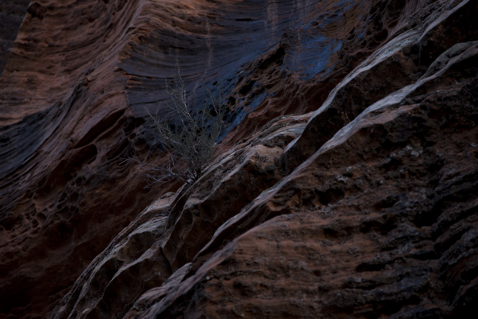
JXD,
I think personally I would adjust the Shadows. I like these kind of photos and want to see more as the eye would sometimes.
I hope you don't mind, but I took the liberty to quickly adjust the third photo.

You don't lose the skate and the window, but more to look at.
My 2¢
I think personally I would adjust the Shadows. I like these kind of photos and want to see more as the eye would sometimes.
I hope you don't mind, but I took the liberty to quickly adjust the third photo.
You don't lose the skate and the window, but more to look at.
My 2¢