


You are using an out of date browser. It may not display this or other websites correctly.
You should upgrade or use an alternative browser.
You should upgrade or use an alternative browser.
The Best Logo or Trademark
- Thread starter comish4
- Start date


arts
Addicted Member
The band Dead Kennedys
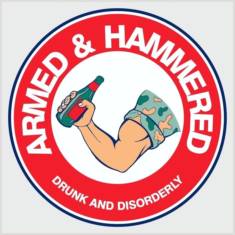
I'll see your DK's and raise you Armed and Hammered



Spacey37308
Active Member


Poultrygeist
Lunatic Member


I'll see your DK's and raise you Armed and Hammered
This also reminds me of my Schon & Hammer album cover..






Artie
Super Member
I like Luxman the best, simple and elegant like the dual R Rolls Royce.
Interesting trivia: The Rolls logo was originally red. They changed it to black after he died. And while we're talking cars, I always liked the Alpha Romeo logo. A dragon eating St. George:


Genov
Super Member
The Yamaha and Pioneer logos have already been mentioned. The Yamaha logo stands for the "three pillars of their business" (Google search), but it also reminds me of a wheel, and hence ties in with their motorcycles. The Pioneer logo with the tuning fork inside the omega symbol shows the connection of electronics and music to produce audio equipment. When they changed their logo in the 1990s, I thought the new one sucked.
How about these?
View attachment 2081397
View attachment 2081398
View attachment 2081399
I love the classic Stax logo!!!
KentTeffeteller
Gimpus Stereophilus!
Like Bass brewery's red triangle.
I wanted to reproduce the classic VW logo recently. I found that it had been defined by some very simple stroke widths, and one angle. The recent rebrand is an abomination, imho...
https://imjustcreative.com/vintage-vw-logo-specification-poster/2019/09/26
I've always liked Kef's logo: a simple stylised K that represents a speaker cone.
View attachment 2078335
KEF= Kent Engineering Foundry. Therefore, this Kent loves the name, and also enjoys the superb quality of KEF loudspeaker drivers, and complete loudspeakers. This is in build, and in sound quality alike.



Poultrygeist
Lunatic Member



I am just a beginner designer, and I need to look at good works as much as possible and gain experience. For us, it is important not only to be able to fulfill orders but also to distinguish good work from bad. Therefore, I really like posts like this. so far, I'm looking for inspiration on sites like create.vista.com for my work, but I also like to look for ideas on forums among the same guys as me. Don't think that I'm stealing some work and passing it off as my own; I'm just saying that it's very important for any specialist to consider different work options in their field.I have found so many new ideas for my logo, thank you very much!