

You are using an out of date browser. It may not display this or other websites correctly.
You should upgrade or use an alternative browser.
You should upgrade or use an alternative browser.
The Best Logo or Trademark
- Thread starter comish4
- Start date








I'm way late to this thread, and several I really like were already mentioned upthread: Sansui as seen in my avatar pic (of course) with and without the Kanjii characters, and the older variant S wrapped around the transformer core. The newer 1987 logo has grown on me, but still heavily prefer the classic script. It just looked classy.
Kyocera is another great one from a purely graphic design standpoint. Pioneer from circa 1972 with the then new stylized logotype added alongside the tuning fork/omega mark was a killer logo, and I was actually kind of pissed off when they dropped it for the current one. Alpine is one that has remained unchanged for a long time, and still looks good, but in a retro way now. The old Alps logo inside the oval is another neat one, but I couldn't find an image to post.
The Luxman L is so simple yet so cool, as is the Nakamichi logo, both were well done by whoever designed them. I've long liked the Cerwin Vega CV mark that looks like a speaker driver facing upright (C for the cone, V for the basket). The classic 70's Kenwood logo was another great one, the present day one adopted sometime in the 80's is boring.
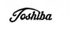
One I didn't see mentioned yet was the classic Toshiba script logo:
The 1963-92 NEC logo:

And the vintage (60's-very early 70's) Akai logo:

Tangentially related to audio products for their many semiconductor parts without which much hifi gear might not have been built, and more recently ADC/DAC IC's, is Texas Instruments:

Since I'm a keyboard player, I'll drop these here as well, as they have been important to much music I've both played and listened to:



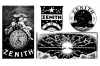
It's funny, being born in the 70's and growing up in the 80's I do get a little bit nostalgic for the the RCA and Zenith logos of the era (RCA still being unchanged even now), even if most of their products had turned to cheap discount store crap by the time I was in high school.
Kyocera is another great one from a purely graphic design standpoint. Pioneer from circa 1972 with the then new stylized logotype added alongside the tuning fork/omega mark was a killer logo, and I was actually kind of pissed off when they dropped it for the current one. Alpine is one that has remained unchanged for a long time, and still looks good, but in a retro way now. The old Alps logo inside the oval is another neat one, but I couldn't find an image to post.
The Luxman L is so simple yet so cool, as is the Nakamichi logo, both were well done by whoever designed them. I've long liked the Cerwin Vega CV mark that looks like a speaker driver facing upright (C for the cone, V for the basket). The classic 70's Kenwood logo was another great one, the present day one adopted sometime in the 80's is boring.
One I didn't see mentioned yet was the classic Toshiba script logo:
The 1963-92 NEC logo:
And the vintage (60's-very early 70's) Akai logo:
Tangentially related to audio products for their many semiconductor parts without which much hifi gear might not have been built, and more recently ADC/DAC IC's, is Texas Instruments:
Since I'm a keyboard player, I'll drop these here as well, as they have been important to much music I've both played and listened to:
It's funny, being born in the 70's and growing up in the 80's I do get a little bit nostalgic for the the RCA and Zenith logos of the era (RCA still being unchanged even now), even if most of their products had turned to cheap discount store crap by the time I was in high school.




Poultrygeist
Lunatic Member
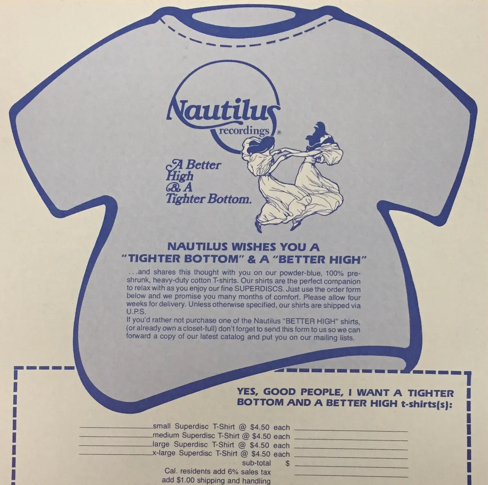
Some of you might remember Nautilus Records.





Dswankey
Lunatic Member
From back in the Hayday of Audio who did you think had the Best Logo or Trademark? What is your favorites?
Having gone through the whole thread I was surprised no one posted or mentioned






simplicity
