

You are using an out of date browser. It may not display this or other websites correctly.
You should upgrade or use an alternative browser.
You should upgrade or use an alternative browser.
The Best Logo or Trademark
- Thread starter comish4
- Start date


RunOutGroove
Addicted Member
Yes, that logo is very well designed. My only issue with it is with the type. I don't love the typeface that was used. The way that the lines vary in weight and the cup serifs on it just don't make for a great looking typeface in my opinion. I have to wonder just how much care there was in choosing that particular typeface. I realize though that these are the sort of details that few others would ever notice...I've always liked Kef's logo: a simple stylised K that represents a speaker cone.
View attachment 2078335


cpt_paranoia
Addicted Member
My only issue with it is with the typ
I think the lettering was a transient addition [edit: I'm wrong; looking at old data sheets, it's there. I'm sure I recognise the font, but I can't recall its name]. Note that I pulled that logo implementation from a free source, not the original. I'm not sure how accurate it is.
I realize though that these are the sort of details that few others would ever notice
I volunteer with the Duke of Edinburgh's award scheme. You can download their logo pack as EPS files (produced in Adobe Illustrator; none of the AI extensions included in the EPS are actually used, so I could shrink it from 420k to 12k). Looking closely at it, I spotted a dent in the 'D' of the logo. Now I can't not see it... When I provided feedback, they said they would refer my observation to their professional graphic designers. The dent is still there...

Last edited:


teal'c
Nuclear Cardiac Parent
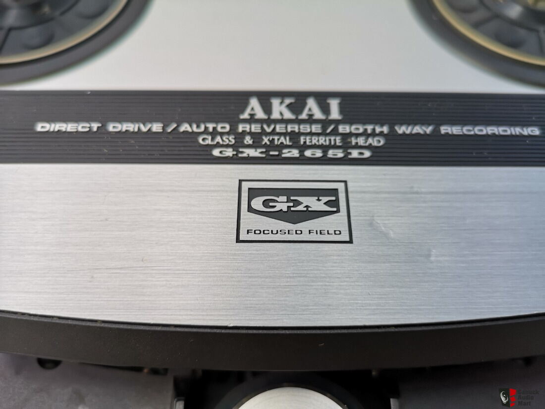
Fine art.This goes way, way back but love it......



cpt_paranoia
Addicted Member
I confess that I prefer purely graphical or figurative logos to wordmarks. Much as I admire custom typography, and created a custom font wordmark for my fictional corporate entity...


