


You are using an out of date browser. It may not display this or other websites correctly.
You should upgrade or use an alternative browser.
You should upgrade or use an alternative browser.
NEW - McIntosh MC1502
- Thread starter techguy0192
- Start date

Register to hide this ad

twiiii
Lunatic Member
Thats one big amp. I still think the inputs ought to be below the slanted surface so we can safely separate line level circuits from high voltage circuits on the other end of the amp. Plus I would orient the amp with the slanted surface toward the left so wouldn't need the MC 1502 sign on the slanted surface. . Its a shame the unit can't be used as a mono amp. Wouldn't need 2301's . I wonder if todays KT 88 last any longer than the Gold lions I used in my 275's over 50 years ago. I use to test the MC 60's 240's and 275's every six months and replace tubes as necessary. The 275's and MC 60's it was mostly miniature tubes. The 240's if it weren't the 12GH7's it was the 6l6. I always wanted to try KT 66 but they weren't available locally. Replacing tubes all the time is why I moved on to SS. To soon for sure. I should have waited till MC 7200's came along.
Last edited:

I wonder if this means the MC275 will eventually be phased out.
No. This amp is targeted at people that are buying a pair of 275s amps to bridge.

arts
Addicted Member
Nope. I really do not like the looks or layout of the MC1502.
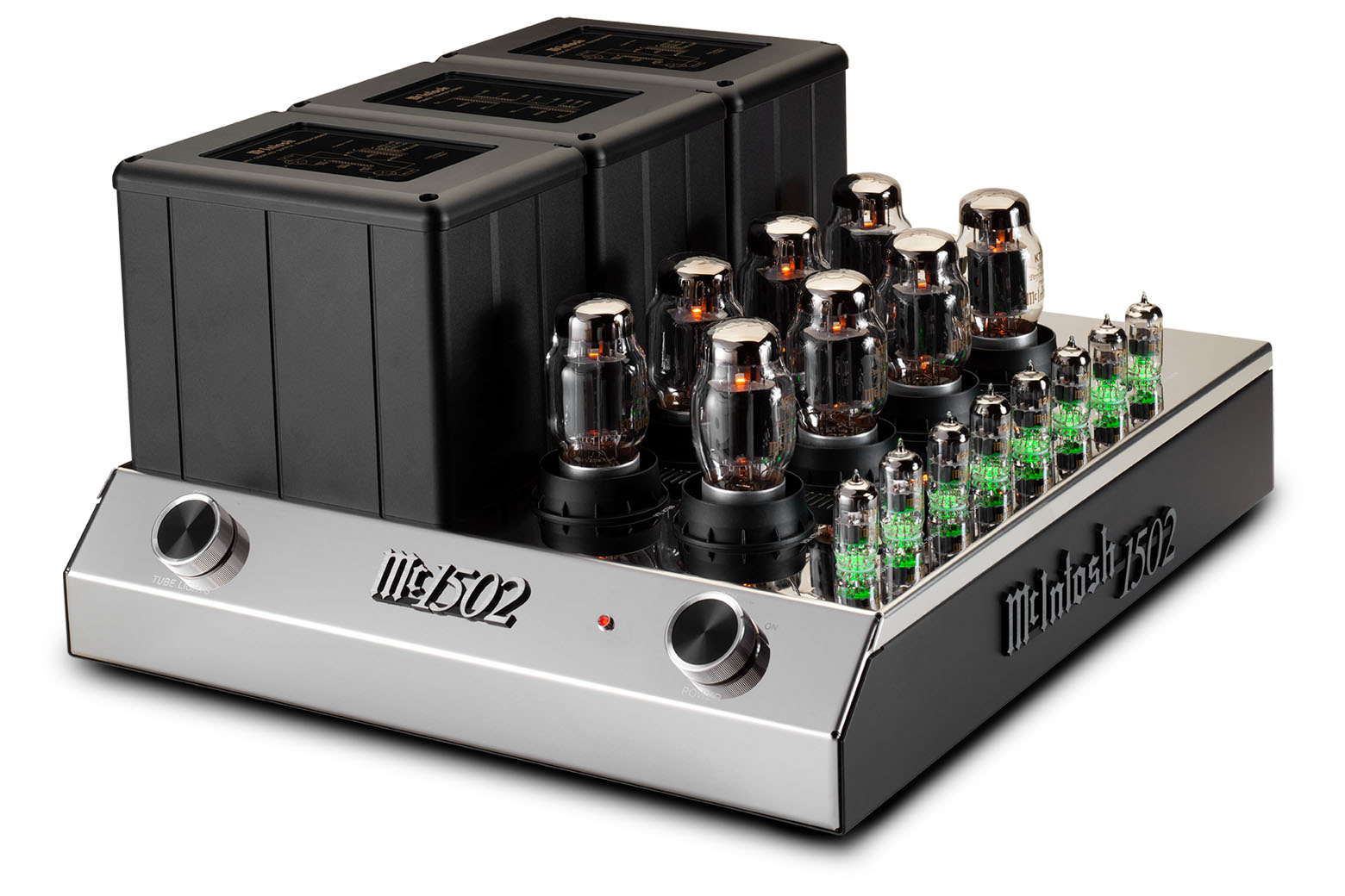
The transformer and tube locations are perfect, and nicely symetrical. But that's it.
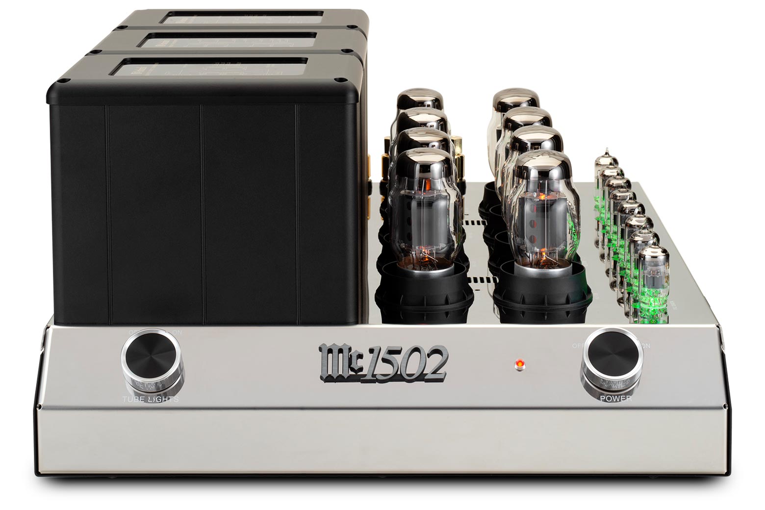
The sloped side panel looks huge and empty, and the control placement is not visually well proportioned. The badge in the middle looks like a throw-in afterthought to try and mitigate the emptiness.
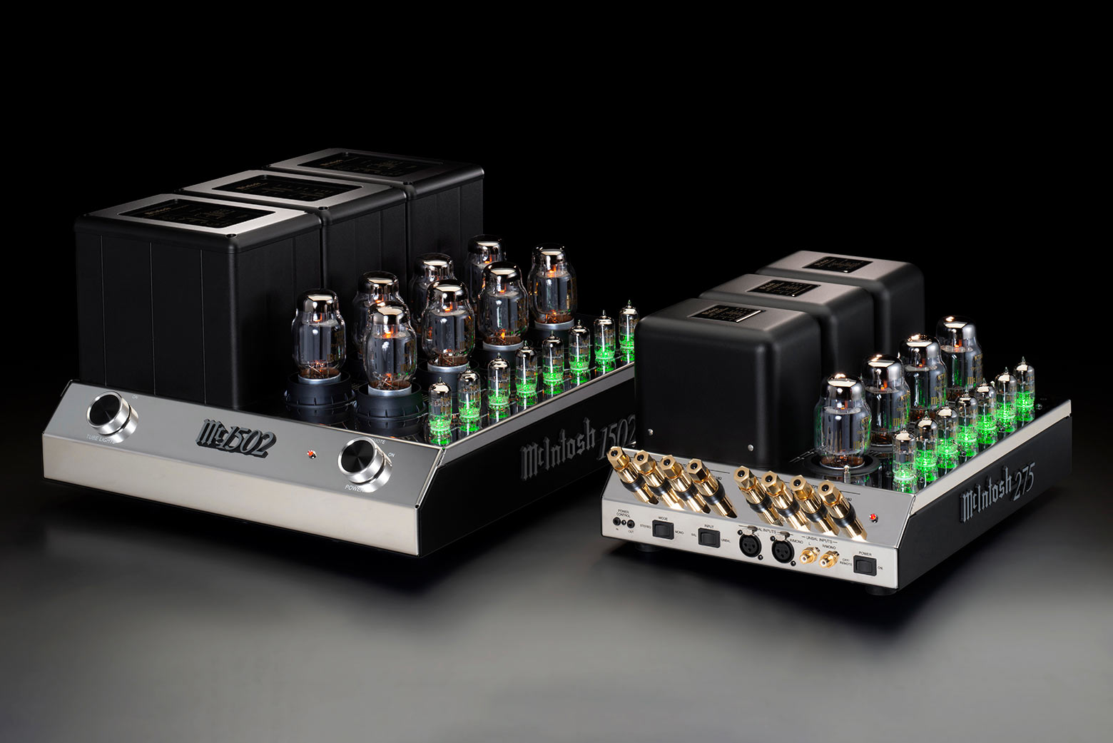
Locating the output terminals on top of the chassis not only looks terrible, but in such close proximity to one of the transformers seems to be less than convenient from an ergonomic standpoint. Also, having both sets of speaker cables exiting from one side of an amplifier just seems wrong. And having them visible (regardless of how much they cost) from the front of the unit seems even more wrong.
Locating all of the other connections and switches to the vertical side panel is once again a visual detraction; you cannot place this unit in it's traditional (and probably intended) operating/viewing position without having to see a bunch of other cables sticking out of the side, in addition to the speaker cables.
This was obviously a clean-slate design that gave a clear nod to the MC-2x and MC2xx amplifiers of the past and present that unfortunately misses the boat on several levels.
In my mind, McIntosh missed a great opportunity to retain the classic styling of one of the most recognizable and iconic audio amplifiers of all time, while cleaning up old aspects that are really less than visually acceptable to many of todays users.
EDIT: Whoever suggested, and more especially, whoever approved that cheesy under-tube-lighting gimmic should be given their walking papers and escorted to the curb. After a good slap upside the head,of course.
The transformer and tube locations are perfect, and nicely symetrical. But that's it.
The sloped side panel looks huge and empty, and the control placement is not visually well proportioned. The badge in the middle looks like a throw-in afterthought to try and mitigate the emptiness.
Locating the output terminals on top of the chassis not only looks terrible, but in such close proximity to one of the transformers seems to be less than convenient from an ergonomic standpoint. Also, having both sets of speaker cables exiting from one side of an amplifier just seems wrong. And having them visible (regardless of how much they cost) from the front of the unit seems even more wrong.
Locating all of the other connections and switches to the vertical side panel is once again a visual detraction; you cannot place this unit in it's traditional (and probably intended) operating/viewing position without having to see a bunch of other cables sticking out of the side, in addition to the speaker cables.
This was obviously a clean-slate design that gave a clear nod to the MC-2x and MC2xx amplifiers of the past and present that unfortunately misses the boat on several levels.
In my mind, McIntosh missed a great opportunity to retain the classic styling of one of the most recognizable and iconic audio amplifiers of all time, while cleaning up old aspects that are really less than visually acceptable to many of todays users.
EDIT: Whoever suggested, and more especially, whoever approved that cheesy under-tube-lighting gimmic should be given their walking papers and escorted to the curb. After a good slap upside the head,of course.

chuckworkb
Super Member
You can probably turn off the green LED's if you don't like them. You can on the MC275 VI.EDIT: Whoever suggested, and more especially, whoever approved that cheesy under-tube-lighting gimmic should be given their walking papers and escorted to the curb. After a good slap upside the head,of course.
chuckworkb
Super Member
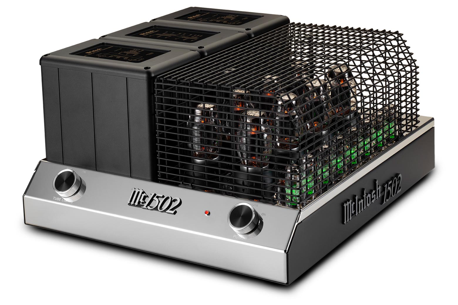
I think moving the speaker connections to the rear was a good idea. That cage would stay in the box.

marantzfan
...
Nope. I really do not like the looks or layout of the MC1502.
The transformer and tube locations are perfect, and nicely symetrical. But that's it.
The sloped side panel looks huge and empty, and the control placement is not visually well proportioned. The badge in the middle looks like a throw-in afterthought to try and mitigate the emptiness.
Locating the output terminals on top of the chassis not only looks terrible, but in such close proximity to one of the transformers seems to be less than convenient from an ergonomic standpoint. Also, having both sets of speaker cables exiting from one side of an amplifier just seems wrong. And having them visible (regardless of how much they cost) from the front of the unit seems even more wrong.
Locating all of the other connections and switches to the vertical side panel is once again a visual detraction; you cannot place this unit in it's traditional (and probably intended) operating/viewing position without having to see a bunch of other cables sticking out of the side, in addition to the speaker cables.
This was obviously a clean-slate design that gave a clear nod to the MC-2x and MC2xx amplifiers of the past and present that unfortunately misses the boat on several levels.
In my mind, McIntosh missed a great opportunity to retain the classic styling of one of the most recognizable and iconic audio amplifiers of all time, while cleaning up old aspects that are really less than visually acceptable to many of todays users.
EDIT: Whoever suggested, and more especially, whoever approved that cheesy under-tube-lighting gimmic should be given their walking papers and escorted to the curb. After a good slap upside the head,of course.
All of this.
Mac missed an opportunity at creating an instant classic had they just kept with the styling of the MC275 instead of this new Chi-Fi styling they’ve been chasing as of late...

JWJW
Bun E. Carlos
All of this.
Mac missed an opportunity at creating an instant classic had they just kept with the styling of the MC275 instead of this new Chi-Fi styling they’ve been chasing as of late...
Without the tube cage, I think it’s a beautiful amp. I would buy one....maybe someday (sigh).
Yes, the tube cage looks terrible. Also, the badge between the light and power knobs look too small with poor proportions. IMO, they could have simply copied the 275 into a larger chassis and called it a say. It's hard to beat the classic design of the 275.
arts
Addicted Member
I think moving the speaker connections to the rear was a good idea. That cage would stay in the box.
The speaker connections are on the top of the chassis,and I don't know if the location could be considered the rear
Is it just me, or does the tube cage look like a painted chip-basket from a commercial deep fryer?
I believe that "most" owners would position the unit in the long side forward orientation,which is going to look like crap with all of the wiring hanging out of the right side panel and the top of the chassis. I have never seen anyone position a Mac 2xx series knob-end forward,unless they were terribly short of space. And I don't imagine this amplifiers intended demographic being challenged for space

My choice would have been turning the two outermost transformers 90°, move them forward to be inline with the middle transformer, and use the space gained behind them to mount the speaker connections. All other connections would have been located on the panel below and behind the transformers.
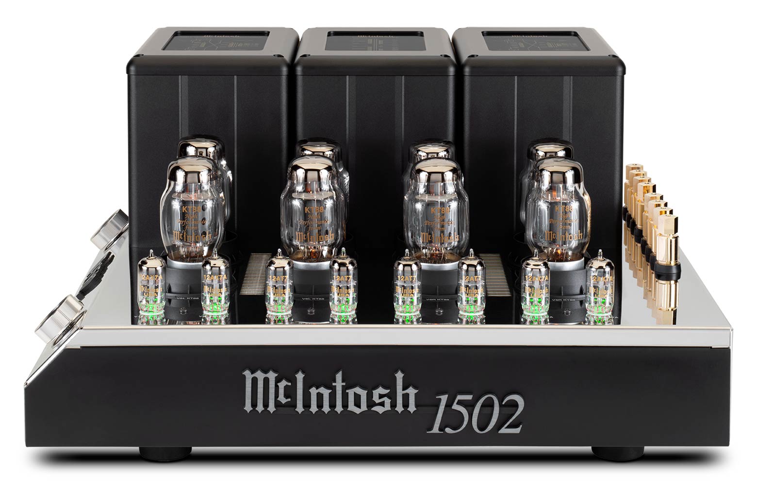
Is it just me, or does the tube cage look like a painted chip-basket from a commercial deep fryer?
Nope, you're not alone in that thought. Actually, considering this is an $11,000 amp, the tube cage looks like hot garbage.

How much for just the tube cage?
Hopefully it will be optional and the people that opt for it will have a percentage knocked off the purchase price.


